Bug hunting on iOS 6.3.1
Impulse
Me and my SO recently got an old iPad2, which we were planning to use for everyday usage around the house. Meaning, having it ready to research a recipe, get information about a topic or researching things to do together.
Unfortunately though, the iOS version that it came preinstalled with was 9.3.5. On this later version of iOS there is quite a problem with the responsiveness though.
Probably due to the big alterations on the design side the iPad feels slow and has noticeable lags when switching between applications, and even when using the web browser. The argument for this was, that it never seemed that slow before, and it should not be the hardware that wore down.
So I decided to try and downgrade the iPad and compare a much older version, namely 6.3.1, to the 9.3.5 that was installed.
After doing so successfully via ITunes and an old [IPSW](https://en.wikipedia.org/wiki/IPSW) file it was clear that the assumption was correct. Being back on the old version improved the performance significantly.
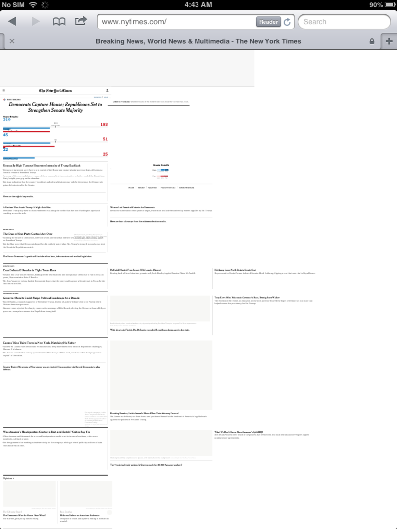
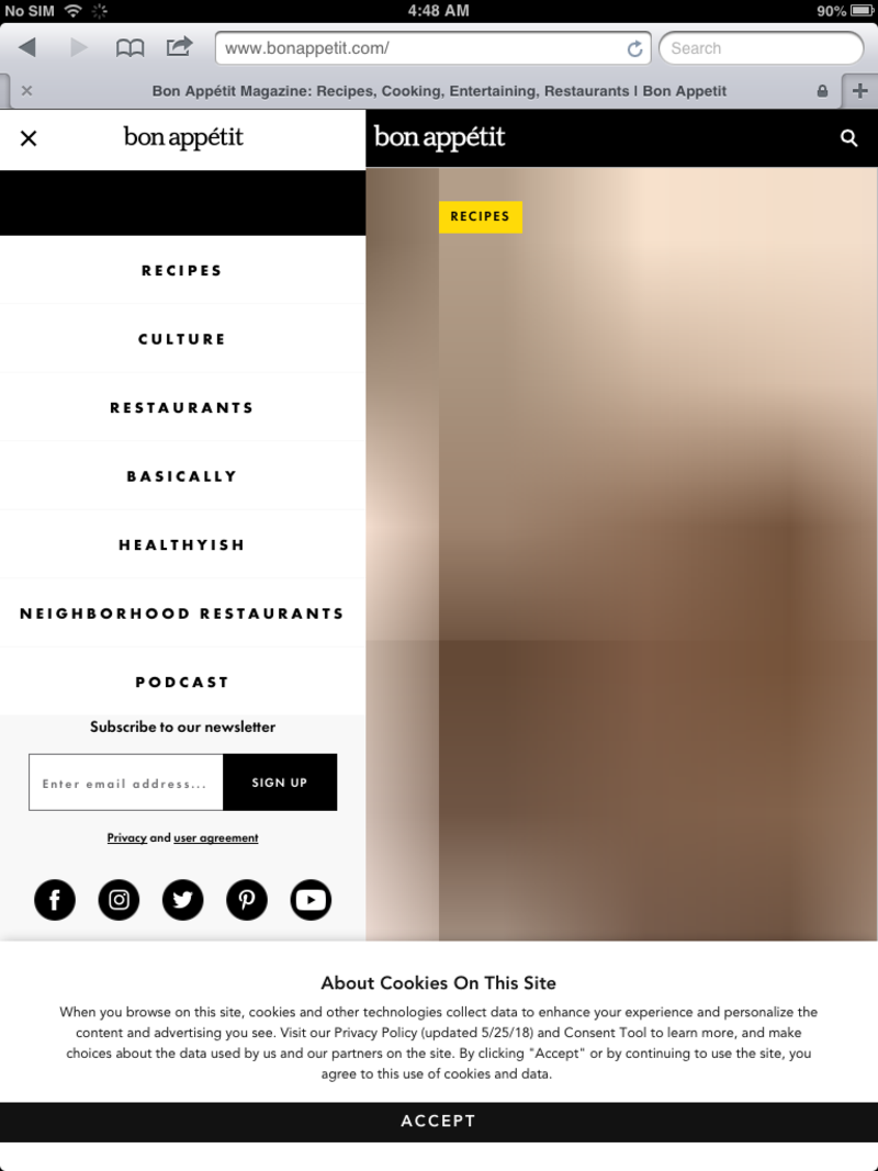
This only goes as far as the web though. When visiting certain websites errors started bringing the user satisfaction back down again.
Here are a a few screenshots of some broken styling:
And some websites were still a pleasure to use, here are the BBC and RA as examples:
Reflection
This made me think to go onto my own blog and start breaking it.
Given all the modern tech that I use for this theme, I would not be surprised to find some thing not working correctly. Mostly due to the CSS Grid specification I am using for the styling.
And indeed it did not take long:
First of all the header is broken, with the navigation links appearing in a horizontal manner, instead of a vertical one.
Additionally after some scrolling the header starts covering most of the content.
Broken Header
Header covering content
My speculation for the first bug being the CSS Grid, while the latter one could be related to the vh and vw units I am using.
Action
Since I am now in possession of a great testing device I set out to fix this.
Setting up my development environment by changing the the address of my development server to 0.0.0.0:8000, thus exposing it my local network, and accessing it on my iPad via IP.OF.MY.LAPTOP:8000, I have a quick feedback loop to test out my ideas and refactorings.
After looking at the stylings for the header the position: fixed; top: 0; turned out to be the problem.
Since this was a problem that was not solved elegantly initially I decided to throw it out completely and instead reiterate on the website design.
Since design in general is an iterative process I will take this as a major stepping stone in finding the right one for my blog.
For now the user (so you) will have to scroll back up to the top of the page in order to navigate. Given all the advanced technology that is on this site though, and its relative simplicity I will start from scratch for the layouting. This time using old methods and then adding modern techniques on top via cascading rules.
Resume
This rather random chain on events has again taught me, and hopefully some of you that are reading this, a lesson. While I always speak up for accessibility and its importantance in our work, I wanted to write the theme for this blog, using all the latest technologies, making my developer life comfortable and the code elegant.
This hypocrisy was made obvious right now, and I will have to backtrack and rework some parts. It also comes to show that some problems stem from architectural decisions rather than a specific bug. My assumptions about what could be breaking were not too far off, but as it turns out the problem has more depth.
While the CSS is easy to refactor and well decoupled, this could have become a nightmare if the project was bigger, since I have already accumulated tech-debt and would just keep on growing it.
But as always, a mistake made now is a mistake avoided in the future.
Cover photo by Tim Goedhart on Unsplash


