Ghost theme - Part 2: a Grid
Please Note that this theme is not in use anymore. See this post for more info.
In this post I want to start with the styling.
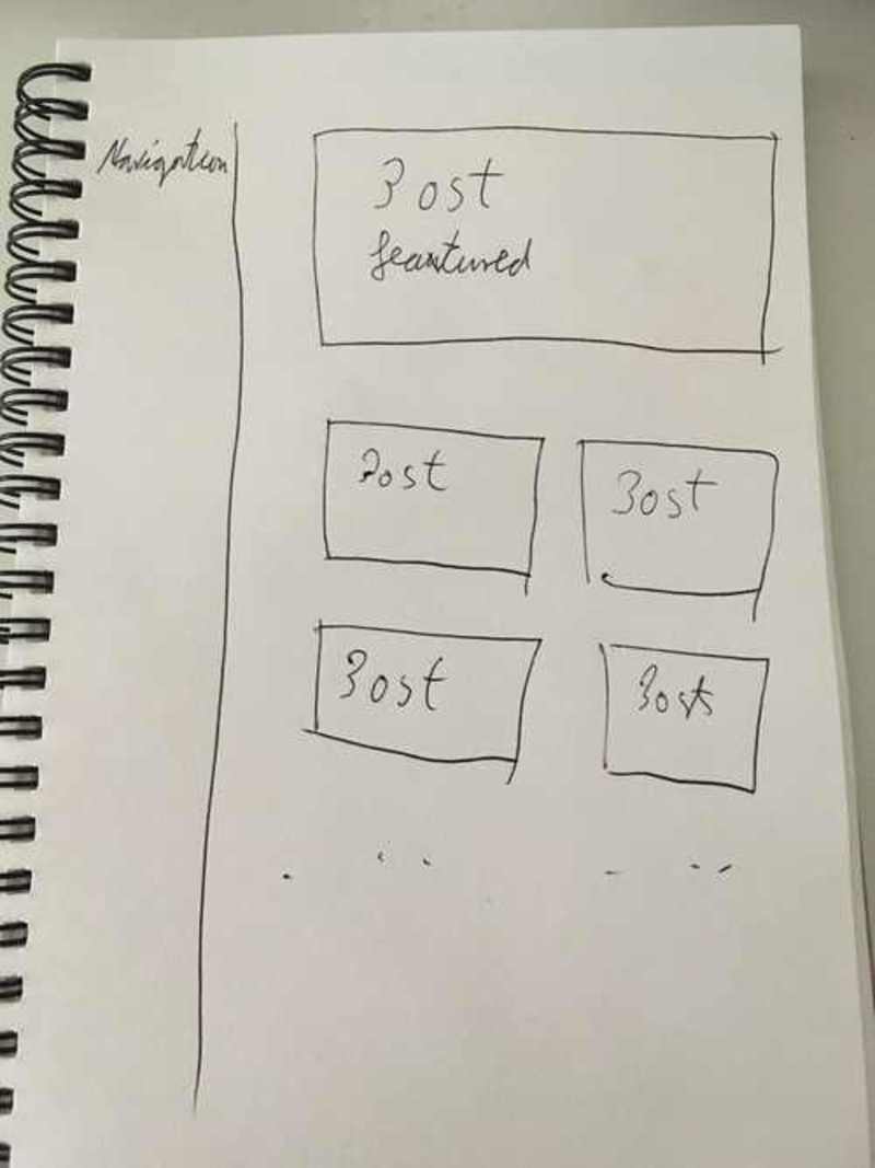
the first thing here is to consult the sketches again.

Since we split out the sidebar into the default layout, we should create a Grid for this first.
The technology I am going to use here is CSS-Grid.
The only to be aware of is the browser support. Check caniuse.com to see if it supports the browsers you want.
Since this is my personal blog and the audience is probably using modern browsers (this is an assumption, as I have no tracking yet) I am totally fine with ignoring older and more exotic browsers for now.
Grid
With tools like https://www.layoutit.com/grid we can quickly generate a basic layout.
The generated code for the grid I want on the blog according to the sketches looks like this
.grid-container {
  display: grid;
  height: 100%;
  grid-template-columns: 20vw 80vw;
  grid-template-rows: 1fr;
  grid-gap: 0px;
  grid-template-areas: "Sidebar Content";
}

.main{ grid-area: Content; }

.sidebar { grid-area: Sidebar; }
This will have to go into a css file at assets/css/styles.css in the theme folder.
Make sure to restart the `npm run start` task, so that gulp can pick up on the newly created `.css` file. Unfortunately this is not detected automatically.
In the default.hbs this stylesheet now needs to be imported and the correct classes need to be added to the HTML in the like following:
<head>
...
<link rel="stylesheet" type="text/css" href="{{asset "built/styles.css"}}" />

</head>

<body class="{{body_class}} grid-container">
    <div class="sidebar">
        <header>
            <h1 class="page-title">{{@blog.title}}</h1>
            <h2 class="page-description">{{@blog.description}}</h2>
            <nav class="navigation">
                {{navigation}}
            </nav>
        </header>
    </div>
    <div class="main">
        {{{body}}}
    </div>
    {{ghost_foot}}
</body>
The <body> is acting as the Grid container, and the sidebar and main where already equipped with the correct classes.
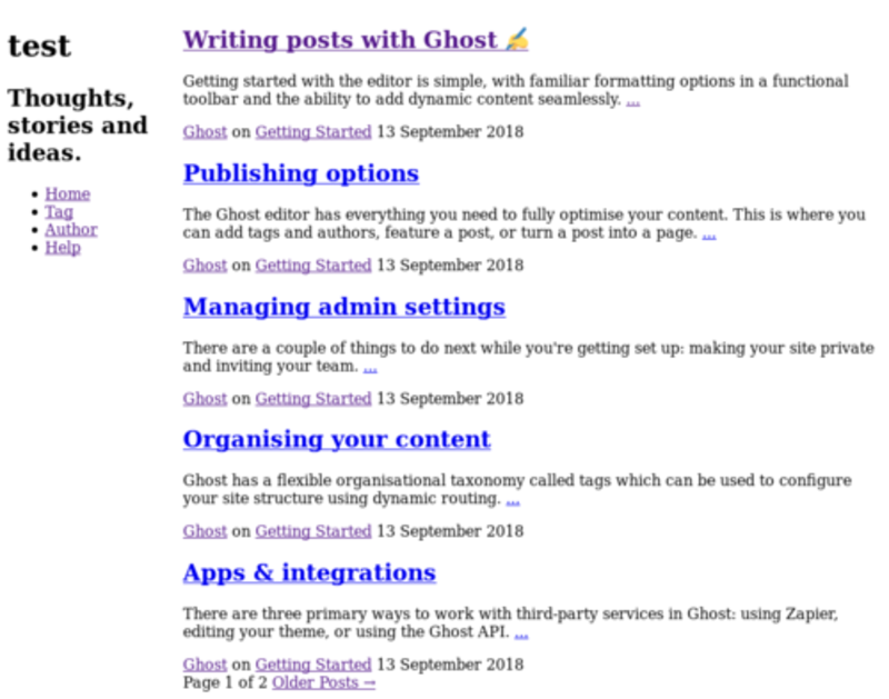
With this simple addition the page already looks like this:

Variables
Now we have a good base to start introducing variables in CSS.
We can use these due to the postcss-custom-properties that are included in the default gotede gulp task.
What this will allow us is to define certain variables that should be applied throughout our app and then reuse them whenever needed.
By doing this we introduce 2 benefits.
- We can easily make a change in 1 place that will be applied everywhere that value was used
- There is 1 place to check in order to find out what specific values are
The place to define those is f.e. assets/css/helpers/variables.css, so lets create some, that we can use for our grid.
:root {
  /* Container sizes */
  --main-width: 80vw;
  --sidebar-width: 20vw;

  /* Gutter sizes */
  --gutter-horizontal--small: 2vw;
}
Notice that they are wrapped in the :root{} block.
Once this is done the gulp task will automatically make those ‘available’ in all our CSS files (This is actually done in the build step, but thats semantics I guess).
Lets import them and use them for the grid like this:
@import "./helpers/variables.css";


.grid-container {
  display: grid;
  height: 100%;
  grid-template-columns: var(--sidebar-width) var(--main-width);
  grid-template-rows: 1fr;
  grid-gap: 0px;
  grid-template-areas: "Sidebar Content";
}

.main {
  grid-area: Content;
}

.sidebar {
  grid-area: Sidebar;
}
You can see that the variables are used with var(VARIABLE_NAME). While this might not seem super important or useful right now, be sure that this will save a lot of headaches down the line.
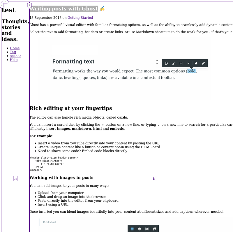
A break in the layout

To fix this lets set a max-width on the main container. This does exactly what the name implies, telling it that its maximum width should be of some value.
Which one is the correct value? Given our Layout it should be the --main-width variable. Already comming in handy :).
Lets add it to the .main block
.main {
  grid-area: Content;
  max-width: var(--main-width);
}
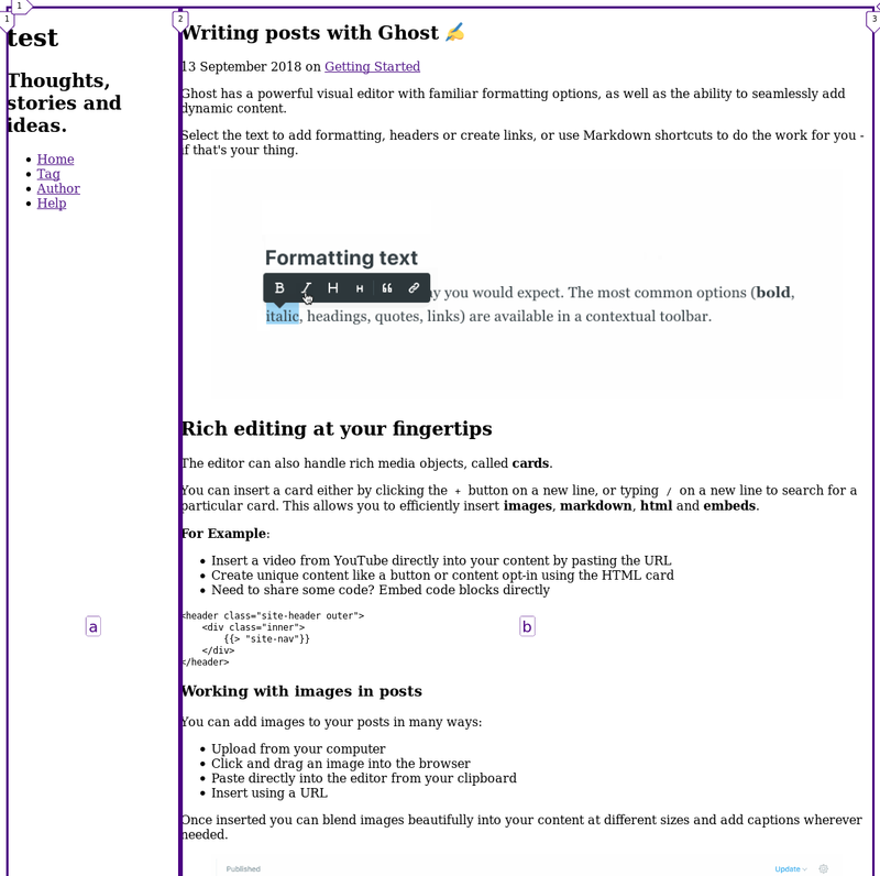
Check out the post again. All good?
Nope, looks like the picture is still escaping to the right.
If you inspect the HTML you can find the picture class .kg-image. For this class we will add a rule of max-width: 100%; for now, until we encounter the styling of the pictures again, later on.

By the way, you can ignore the purple lines.
These are added by the Firefox developer tools. You can read about these here if you would like to use them too.
A small task for you
Check out the Publishing options article. On this page you should encounter another problem of content escaping.
I will leave this as a small task for you to fix right now. Should you need help or a hint feel free to drop me a short email or contact me on my new twitter.
What next?
The theme already looks quite a bit like the sketch. One thing we need to ensure though, is that there are always only 2 posts next to each other (and maybe alter this idea for mobile devices?).
So the next post will be focussing on those 2 topics including media-queries and flexbox.